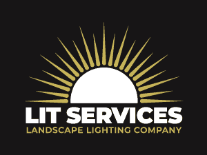
Lit Services is a Landscape Lighting Company that services residential and commercial properties in the Piedmont Triad Region of North Carolina.
Brand
Color Choices
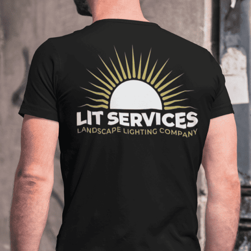
White: Symbolizing purity, simplicity, and clarity. It ensures that the brand retains a clean and minimalistic feel, much like the clarity we bring to lighting designs.
Gold: Representing luxury, quality, and timeless elegance. Commitment to premium quality services and products is reflected in this color. It also brings warmth, reminiscent of the inviting glow.
Black: Denoting sophistication, power, and contrast. Just as the night provides a canvas for lighting, the black in the palette provides a backdrop against which the brand shines
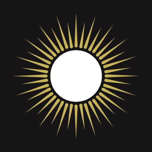
The Logo
A Circle Emitting Light: The circle is a symbol of unity, wholeness, and infinity. It represents the completeness of services, from design to installation and maintenance. The emanating light from the circle reinforces our expertise in lighting, highlighting the ability to transform spaces and turn visions into luminous realities.
Logo Creation
Color Palette
Wordmark
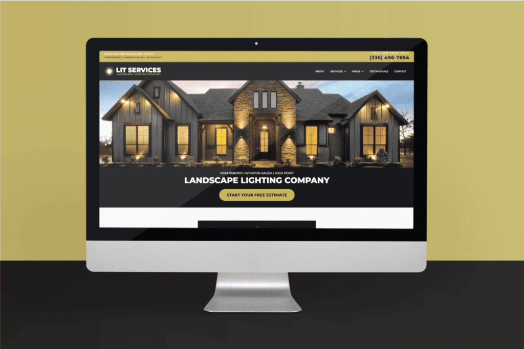
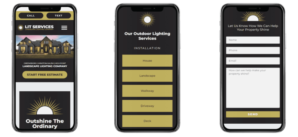
Web Design
The design of the Lit Services website was carefully crafted with two primary objectives in mind. Firstly, it is optimized for conversions, ensuring that every visitor is intuitively guided towards taking actionable steps. This facilitates a smooth and engaging user experience.
Secondly, the layout and visuals have been curated to showcase the company’s craftsmanship in landscape lighting. Every element on the site serves to highlight our expertise, passion, and commitment to illuminating spaces with unparalleled finesse.